
Beyond the mouse
What happens when accessibility stops being theoretical?
Imagine you’ve just had a car accident and are trying to fill out a car insurance form. You’re already stressed, and now your laptop trackpad has stopped working too. Relying on your keyboard to navigate, you try your best to complete the claim online, only to realise the insurer's website is almost impossible to use without a mouse.
At Zurich Insurance, I found the website was completely inaccessible to keyboard users. Through accessibility testing and live keyboard-only exercises with stakeholders, I made the issue visible and built momentum for broader improvements. Working within CMS and release constraints, I collaborated with our offshore development team to make the website fully keyboard accessible. The work raised the accessibility score by 35% and put Zurich ahead of the regulatory shift that followed.
Date
January 2022
Duration
6 Months
Tools and methods
Accessibility auditing, heuristic evaluation, WCAG guidelines, BrowserStack, live keyboard-only exercises, Jira, Figma
Role
Sole Product Designer within Zurich's digital team. I built the organisational case for prioritising accessibility and coordinated with an offshore development team in Vietnam to deliver changes within CMS and release constraints
0%
0%
Increase in accessibility score
0 to 6 Months
0 to 6 Months
Release timeline cut in half
0%
0%
Keyboard navigation completion rate
The problem
During routine website work, I noticed I couldn't navigate the site using only my keyboard. With no brief and no plan in place to address it, the site was systematically excluding anyone unable to use a mouse.
For an insurance company whose customers often interact during stressful moments, this was a significant problem. People relying on keyboard navigation include those with motor impairments, temporary injuries, or broken hardware, often at the exact moment they need clear information quickly.
Internally, there was little awareness of accessibility standards or their implications. The site lacked basic features including keyboard navigation, skip-to-content, and visible focus indicators. Without someone identifying and prioritising these issues, they would likely have remained unresolved.
The challenge was not only technical but organisational. Accessibility fixes required developer time within an already constrained release schedule, not just CMS changes. And as accessibility was not yet a regulatory requirement, there was no mandate, budget, or incentive to prioritise it. The real challenge was making the case for a problem few internally had experienced themselves.
Process
Experience had taught me that usability problems become far harder to ignore once people can see and experience the barriers directly. Rather than follow a predefined process, I let the evidence shape the approach at each stage: establishing the scale through testing, deciding how to make the impact tangible to stakeholders, then working with developers to prioritise and deliver within technical and release constraints. I started by making one of the less visible barriers tangible (Fig. 1).
Fig. 1: A focus indicator is present... Can you see it?

A clear focus indicator now makes the keyboard user's position visible.

From observation to evidence
Before proposing solutions, I needed to determine whether the issue was isolated or systemic, so I looked for tools available to us to investigate further. Siteimprove, used for analytics, could also audit for accessibility. BrowserStack, used for release testing, allowed me to check keyboard navigation across browsers and devices. The findings quickly showed the problem extended far beyond a few isolated pages (Fig. 2).
With the scale established, the challenge shifted to organisational buy-in. Accessibility had never been a priority, and there was no existing research into how disabled people experienced the site. Data alone would not be enough; stakeholders needed to experience the problem firsthand before they'd prioritise it.
The audit identified several accessibility issues, but I needed a way to make the problem understandable to everyone. Keyboard accessibility gave me that opportunity. Unlike issues such as colour contrast, font size or line height, I could ask people to put their mouse aside and experience the barrier directly. I decided to use keyboard navigation as the focus for the stakeholder exercises because it allowed people to experience the problem rather than simply hear about it.

Fig. 2: Before and after; improving the visibility of the existing focus indicator so keyboard users can clearly see their position.
Making the impact tangible
I wanted people to experience the problem and feel the frustration. I began giving short intros to accessibility in team meetings. Then I asked everyone to complete two tasks using only their keyboard: navigate to the life insurance quote from the homepage, then complete it (Fig. 3). They couldn't reach the quote from the homepage, and then they couldn't get past step one. There was no clear indication of focus, and key elements couldn't be reached or opened.
The commercial implications were hard to ignore. Keyboard-only users aren't a niche group. They include people with permanent motor impairments, as well as anyone with a temporary injury, a broken trackpad, or a preference for keyboard navigation. Customers in any of those situations couldn't reach the quote, let alone complete it. That wasn't an edge case; it was a barrier between potential customers and a product Zurich was trying to sell.
The tasks showed the barrier, but couldn't replicate what a disabled person experiences day to day or replace research. I treated them as a starting point. They built enough understanding and momentum to open the door to the research and wider accessibility work that needed to follow.

Fig. 3: The two keyboard-only exercises used to make accessibility barriers tangible to stakeholders.
Finding a way forward
The tasks built enough understanding and momentum to get leadership behind the work. My first step was to speak with the content management system (CMS) team to understand whether the accessibility issues could be addressed within the system.
It became clear that the changes couldn't be made through the CMS. Basic improvements such as visible focus indicators required development work, which meant bringing in DXC, Zurich's third-party development team in Vietnam.
Action
The DXC developer team and I started working together on the Jira ticket for keyboard accessibility. I documented what needed to be achieved and used visual examples to show what we were aiming for.
We worked iteratively, and during weekly meetings we discussed outstanding issues, reviewed our progress, and refined our work within the testing environment (Fig. 4). Accessibility was relatively new territory for the developer team, so we were all learning together.
Navigating the release cycle
As the changes came together, I used the testing environment to update stakeholders on what had been achieved. I took them through the same two exercises we'd used at the start: navigating from the homepage to the life insurance quote using only a keyboard, then completing the quote.
This time, both tasks could be completed. Menus and navigation worked by keyboard, focus was clearly indicated, and a skip-to-content option made moving through the page easier (Fig. 5). What had been impossible to navigate could now be completed without a mouse.
These updates kept the work visible and helped build momentum towards release. The changes were ready in the testing environment, but DXC's release cycle meant they still had to wait for a deployment slot. Continuing to demonstrate progress helped keep accessibility on the agenda rather than allowing the work to disappear into the backlog.
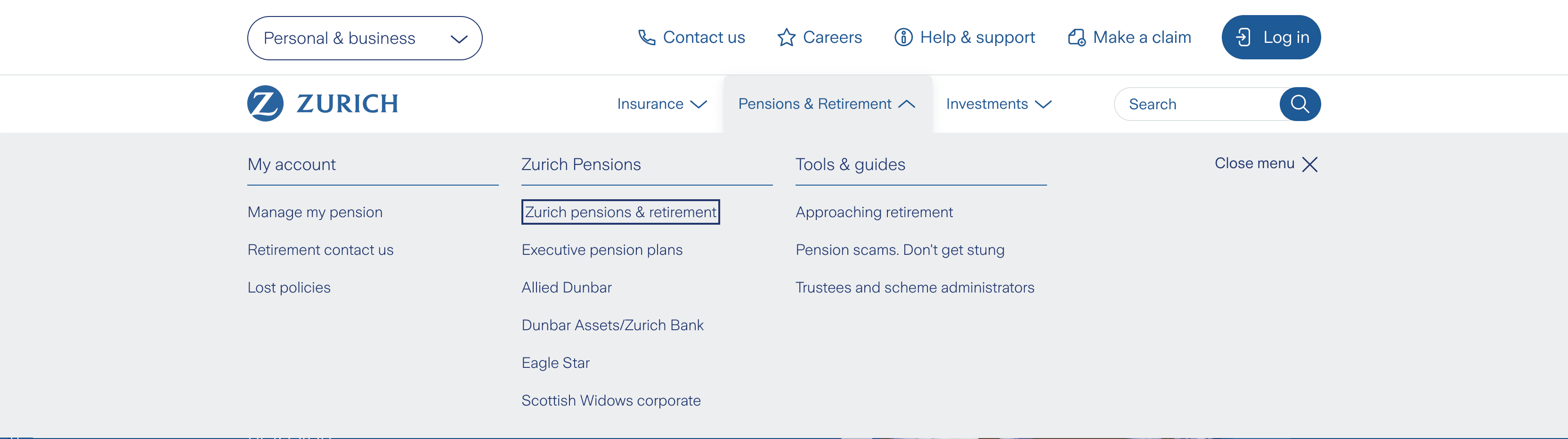
Fig. 4: Demonstrating how users could now access the navigation dropdown menu using only their keyboard.
During release planning, I kept bringing the work forward, highlighting that the implementation was already complete and required relatively little effort to release. By keeping the work ready and visible, I made it easier for the team to say yes when a release opportunity came up.
It paid off. I'd initially been told a release slot could take up to a year, but we got the changes live within six months.

Fig. 5: Improved focus state makes the selected action clear to keyboard users.
Results
The work transformed Zurich's website from an experience that was impossible to navigate by keyboard into one that could be fully used without a mouse. The changes removed barriers across the site, making menus, navigation and previously inaccessible elements reachable by keyboard.
The Siteimprove accessibility score rose from 65 to 88, a 35% relative improvement. In keyboard-only usability testing, task completion on the life insurance quote journey rose from 0% to 95%. This tested keyboard operability rather than the full experience of assistive technology users, but it confirmed the core barrier had been removed.
The work also helped move accessibility higher up the organisational agenda. As regulatory expectations around Consumer Duty developed, Zurich was already building capability in the area. A larger budget followed, including dedicated resource within the team, and I worked with Nomensa to create internal accessibility guidelines for teams across Zurich (Fig. 6).
Fig. 6: Accessibility workshop delivered with Nomensa as the work expanded into a wider organisational initiative.
Learnings and reflections
There were several points where I wasn't sure the work would make it through. I didn't know whether the CMS could support the changes, and when it couldn't, I had to find another route through the development team. Accessibility was also relatively new territory for everyone, so we had to work through the solution together rather than following an established approach. Even after the changes were working in the testing environment, I was told it could take up to a year to find a release slot.
What I learned was that solving the customer problem was only part of the challenge. I first had to build enough understanding and buy-in for accessibility to be taken seriously, and ultimately secure the resources to take the work further. The work also taught me the value of choosing a starting point that could create momentum: by making one barrier tangible and showing it could be fixed, I built support for a much wider accessibility opportunity.
The tasks were useful for making the technical barrier visible, but they also highlighted what I couldn't learn from them: how disabled people actually experience insurance and navigate Zurich's website. Doing that properly would need research with disabled people, and the investment and organisational support to make it happen.
Next steps
With the wider accessibility work now funded, the next step was to understand the experience directly through research with disabled people. I developed a proposal with Scope to use their Lived Experience Research Panel to explore how disabled people engage with insurance, and where barriers arise when using insurance websites (Fig. 7).
The research would begin with a survey of around 450–500 disabled people, followed by six user-testing sessions covering both the website homepage and the life insurance quick-quote journey. Together, these would give both a broad picture of the barriers people face and a deeper understanding of how those barriers affect their experience.
The aim was to move beyond testing whether the site could be used with a keyboard, and understand how disabled people actually experience Zurich's digital services, giving us the evidence to decide where accessibility work should focus next. I presented the proposal to senior stakeholders, advocating for the investment needed to take the research forward.

Fig. 7: Accessibility research proposal developed with Scope.