
You're a broker getting a business insurance quote for your client on Zurich's SME platform. Early in the journey, the Quick Decisions step is meant to indicate the quote outcome, but provides no clear answer. You continue through the form, only to reach a summary page stating “Refer to Underwriter” with no explanation why. Frustrated and uncertain, you leave to place the quote elsewhere.
At Zurich Insurance, the SME platform’s Trade Net Promoter Score (TNPS), a measure of broker satisfaction, had fallen to 15/100. Without direct access to users, I used analytics and session recordings to identify critical experience failures. The redesign increased TNPS by 133%, improved stakeholder confidence in UX, and contributed to the platform winning an industry award.
Date
January 2025
Duration
8 weeks
Tools and methods
Journey mapping, user session recordings, web analytics, heatmaps, impact/effort matrix, MoSCoW prioritisation, weekly stakeholder sessions, collaborative workshops, iterative implementation
Role
I was the product designer within Zurich’s digital team, leading research and workshop facilitation across SME, technical, and marketing teams while introducing user-centred design practices into the platform redesign process.
0%
0%
TNPS improvements (15 to 35)
0%
0%
Decrease in call volumes
0%
0%
Higher quote-to-policy conversion
The problem
Zurich’s SME insurance platform served brokers across a wide range of business types, each with distinct quoting requirements. Brokers struggled to generate quotes efficiently for their clients, impacting both productivity and Zurich’s competitive position.
The platform’s declining satisfaction scores directly affected team bonuses, increasing pressure to improve the experience. The challenge was twofold.
First, the platform had accumulated features over time without a clear strategic direction. Complex products like fleet insurance, with dozens of vehicle-related fields, were forced into the same interface structure as simpler products. This created experiences that were either overwhelming or overly condensed, frustrating brokers trying to complete quotes efficiently.
Second, direct access to users was limited. The SME team believed existing broker relationships provided sufficient feedback, and that insurance terminology required specialist knowledge.
Although I had access to the UserTesting platform, it did not include SME insurance brokers. I therefore needed to identify alternative research methods to uncover key usability issues and build a compelling case for change using the data available to me.
Process
I faced an immediate challenge. I needed to understand what was driving satisfaction down to 15/100 on a platform I had never seen before, without direct access to users.
The breakthrough came when I discovered that the platform already had session recording software and analytics in place. What initially appeared to be a research limitation became an opportunity to observe authentic broker behaviour at scale (Fig. 1).

Finding problems without users
I immersed myself in intensive sessions with the platform team. The complexity quickly became clear. The platform had been built on an out-of-the-box Acturis solution, with features continually retrofitted over time. With no budget for a rebuild, we had to find ways to optimise within these constraints.
Working alongside team members who were former brokers and underwriters proved both valuable and revealing. When discussing the target audience, I realised much of the team’s understanding was based on personal experience and assumptions rather than direct user research. In reality, they did not truly know their users.
I decided to map the Commercial Combined insurance flow (Fig. 2), the platform's most complex journey and a key business priority. Walking through the experience was eye-opening. There was no onboarding, no help section, and no support. Users were simply expected to know what to do.
I documented these findings in a detailed visual journey map, which became a key tool for helping stakeholders understand the broker experience.
After completing the journey map, I analysed session recordings and analytics. Brokers were not using the platform navigation as intended. Their reliance on the search bar and contact options (Fig. 3) revealed they could not find key features through navigation alone, exposing fundamental issues in how the platform guided users.

Fig 3: User behaviour patterns revealed navigation failures, with heavy clustering on search and contact rather than natural task flows
Session recordings showed brokers caught in frustrating loops (Fig. 4). The Quick Decisions tool, intended to indicate whether quotes would be accepted, referred, or declined early in the process, provided little meaningful feedback. Accepted and referred quotes simply progressed to the next page, while declined quotes displayed only “declined”. Brokers were left guessing.
The ‘Next’ button was also labelled ‘Skip’, signalling to brokers that this section could be bypassed. Many skipped it, only to encounter declines later after completing lengthy quote journeys.
Fig 4: Brokers left guessing about Quick Decision outcomes with no system feedback
Fleet insurance users faced similar issues (Fig. 5). Registration errors appeared without clear resolution paths. In one session recording, a broker submitted a form, refreshed the page three times, and still received no confirmation that their action had succeeded.
Fig 5: Registration errors creating endless loops for fleet insurance quotes
The data revealed a significant issue hiding in plain sight. When brokers received referrals requiring underwriter review, 86% abandoned their quotes instead of submitting them.
Analytics showed struggle scores ranging from 3.4 to 4.1 out of 5 across quote pages, where 5 represented extreme difficulty preventing task completion.
Cross-referencing analytics with session recordings revealed why. Brokers received referrals and rejections without explanations or guidance. Some rejections were caused by system limitations that should have triggered underwriter discussions, but brokers had no way of knowing this.
Without clarity, brokers assumed rejection was final and abandoned quotes that may still have been viable through underwriter review. This was not a user preference issue, it was a system failure. The platform gave brokers no way to understand or act on referrals.
Turning sceptics into collaborators
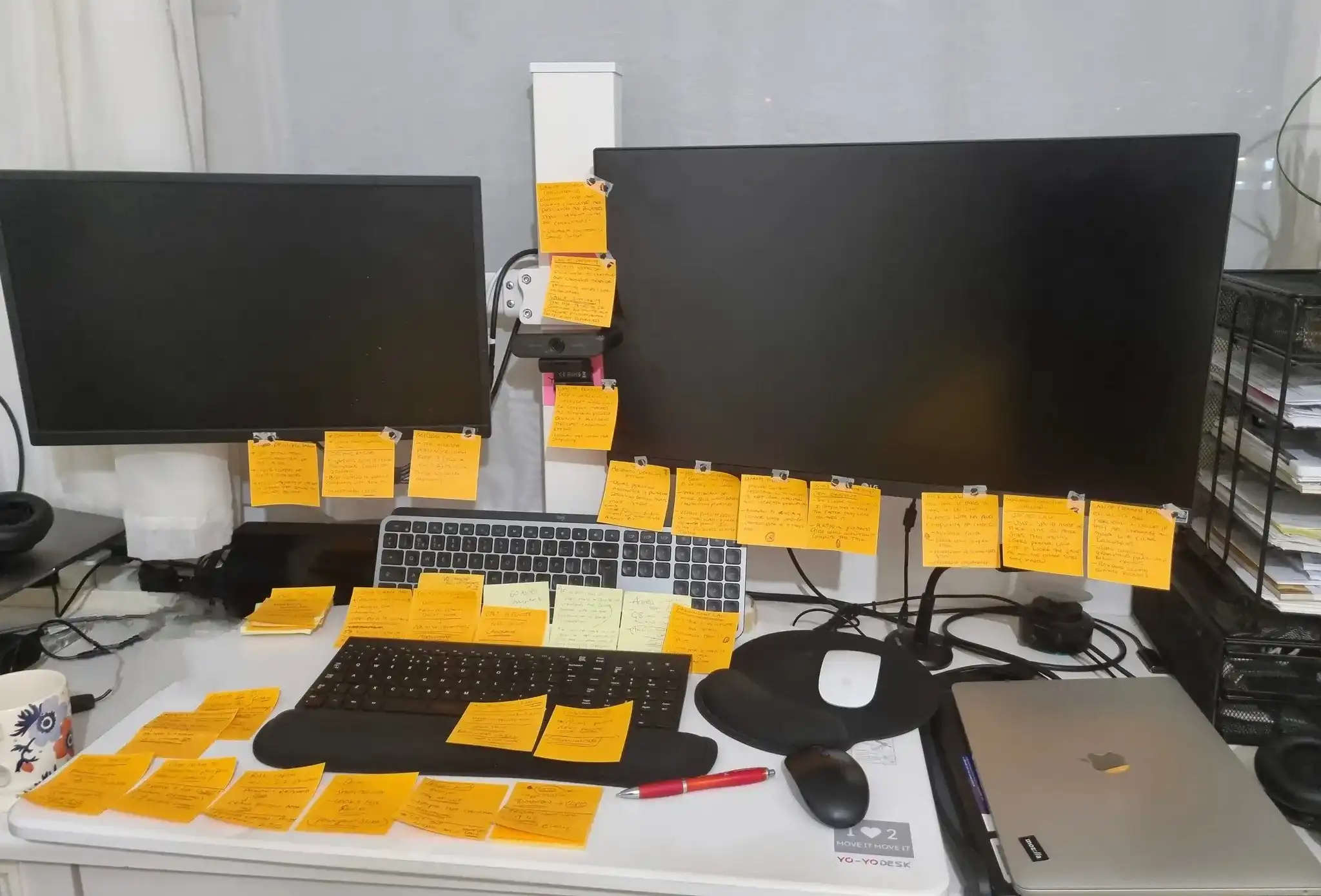
Fig 6: Organising session recording insights before stakeholder consultations, preparing systematically for collaborative validation
By presenting findings as questions rather than audits (Fig. 6), I shifted conversations with the SME team from defensiveness to collaboration.
Session recordings showed brokers consistently missing critical information. The team had assumed brokers would read guidance thoroughly, yet recordings revealed most users never interacted with the helper text. Mandatory fields were unmarked, while important guidance was hidden behind information icons.
This exposed broader trust issues across the platform. In the property damage section, the system automatically added a blank property without notifying brokers. When brokers manually added their own property, confusing validation errors appeared. Resolving the issue often required live chat support from underwriters already aware of the recurring problem.
Analytics revealed almost no interaction with the helper text. Important guidance was hidden behind information icons that expanded on hover, which many brokers did not notice, leading to incorrect policies being created and unnecessary declines.
Meanwhile, mandatory fields had no visual indicators. The team assumed brokers would either know what was required or would simply fill in everything. Instead, brokers used errors as their guide, learning what was mandatory only after submission failed.
Direct feedback suggested satisfaction, but brokers were unlikely to criticise a company they depended on. Anonymous TNPS results told the true story.
The breakthrough came when I sparked the technical lead's interest in UX. She explored it on YouTube and mentioned it in a meeting. As a senior SME team member, her engagement set an example, prompting stakeholders to apply UX thinking to previously overlooked issues.
Action
With clear evidence of the platform’s issues and stakeholders now engaged, I facilitated collaborative workshops with the SME and technical teams to develop solutions. Rather than presenting predetermined fixes, I guided discussions around each critical problem area, helping teams explore solutions together whilst building shared ownership of the outcomes.
Prioritising solutions
The session recordings and analytics had revealed 15+ distinct issues, but the platform's technical constraints meant we couldn't address everything.
I used an impact/effort matrix (Fig. 7) to evaluate each issue against potential business impact and implementation difficulty. This revealed which changes would deliver the greatest value within our constraints.

Fig 7: Evaluating platform issues against impact and effort to identify achievable improvements within the technical constraints.
I then applied MoSCoW prioritisation (Fig. 8) to turn the analysis into a clear implementation roadmap that stakeholders could align around. This helped the team focus on the highest-impact improvements first whilst deferring lower-priority changes within the platform’s technical limitations.

Fig 8: Collaborative MoSCoW prioritisation exercise used to focus delivery on the most valuable improvements.
Developing solutions collaboratively
The workshops helped teams better understand each other’s constraints and identify practical solutions together (Fig. 9) . During discussions around fleet registration, a customer service representative asked which backend system supported the feature, prompting technical specialists to explain architectural limitations while underwriters shared common broker frustrations.
Bringing together customer service, technical, and underwriting perspectives helped us develop solutions that balanced user needs, operational requirements, and technical realities simultaneously.

Fig 9: Cross-functional workshop sessions reviewing platform issues and aligning on practical solutions within technical constraints.
This collaborative approach gradually shifted stakeholder attitudes. The technical team took ownership of implementation within their existing delivery processes whilst remaining actively engaged in design decisions. Their involvement demonstrated they'd found genuine value in the user-centred approach.
Four must-have solutions
Through this collaborative process, we developed four critical improvements.
Quick Decisions clarity
The Quick Decisions tool, intended to save brokers time, was instead creating confusion. We redesigned the messaging to clearly communicate outcomes (Fig. 10), whether accepted, referred, or declined, alongside explanations and next steps. This transformed the feature into a genuinely useful decision-making tool.
Referral guidance
With 86% of brokers abandoning referred quotes, we introduced a Referral Reasons PDF on the quote summary page. This explained what documentation underwriters required, turning referrals from dead ends into actionable next steps.
Fleet registration errors
Brokers were becoming trapped in repeated registration loops when adding vehicles. The technical team resolved the validation issues whilst I introduced clearer guidance for handling errors when they occurred, reducing a major source of daily frustration.
Trade selection accuracy
The homepage trade selection tool displayed all insurance products regardless of eligibility, wasting brokers’ time. We refined the logic so brokers only saw products relevant to their trade type, making the platform faster and more intuitive to use.


Fig 10: Redesigned Quick Decisions with clear outcomes and guidance
These four improvements represented our must-haves: critical fixes addressing daily broker frustrations with achievable implementation.
The broader helper text issues were categorised as should-haves for future phases, requiring more extensive content work. Comprehensive platform restructuring was acknowledged as a won’t-have for this phase due to third-party constraints, though these opportunities were documented for longer-term planning.
Navigating constraints
The platform’s third-party nature presented the most significant constraint. When I suggested moving the Quick Decisions section earlier in the journey, I discovered it could not be relocated due to technical dependencies.
Rather than pushing for structural changes that were not feasible, I focused on improving the experience within the existing framework through clearer messaging, better outcome explanations, and supporting documentation.
Without direct CMS access, I focused on articulating UX principles and defining the improvements users needed, while trusting the technical team to determine the most appropriate implementation approach. This meant framing guidance around user outcomes, such as ensuring brokers received clear confirmation when applications were accepted, rather than prescribing exact technical solutions.
Although the helper text issues represented one of the largest usability problems, implementation priorities ultimately remained with the SME team. I used data-backed recommendations to advocate for change, while recognising that organisational realities required focusing on improvements with the strongest balance of impact and feasibility.
The four implemented improvements addressed the most critical daily frustrations whilst building momentum for broader platform enhancements in future phases.
Results
The approach of working backwards from abandonment data, rather than starting from assumed solutions, is what made these results possible. By identifying the specific moments where brokers lost confidence or clarity, each fix targeted real behaviour rather than perceived preference. Brokers were not just more satisfied; they were completing journeys they had previously given up on (Fig. 11).
The 40% drop in support calls showed brokers no longer needed external help to interpret the platform. The 15% conversion improvement showed the full journey was paying off commercially.
Fig 11: Interactive prototype. Try 'Check my quote' below 👇
The impact reached the organisation too. The department won an industry award for the improvements. The SME team, who had been sceptical of UX at the outset, requested dedicated UX support for their next product. Two technical colleagues who had engaged closely with the process received promotions.
I had not expected that last part. But looking back, it made sense. When people understand why design decisions are made, not just what to build, they start thinking differently about their work. That shift was harder to plan for than any of the platform fixes, and probably more lasting.
"At the beginning, I didn’t really understand what UX was bringing to the team. But once we started seeing the recordings and the issues brokers were actually running into, it became hard to ignore how much impact those problems were having."
Nikki Lidster
Head of SME
Learnings and reflections
Speaking the right language matters more than being right
Throughout the project, I applied the same thinking to stakeholders that I would normally apply to users, paying attention to how different teams interpreted problems and defined success.
The SME team were already highly focused on TNPS because it was one of the main ways the platform and team performance were evaluated internally. I realised that connecting broker frustrations directly to declining TNPS scores helped stakeholders engage with the problems more easily than leading with UX terminology or design principles.
The evidence never changed. What changed was my understanding of how to frame it in a way that aligned with stakeholder mindsets. Successful UX work depends as much on understanding the people inside the organisation as it does the users outside of it.
The experience begins before the main task
Brokers arrived at a bare, generic login page with no indication of what they were logging into. Zurich offered multiple products, yet nothing distinguished this platform from the others. Once inside, the interface reflected years of incremental additions rather than a cohesive product experience. By the time brokers encountered their first real obstacle, a negative impression had already formed.
What struck me was how heavily the business had invested in recovery mechanisms: live chat, phone support, and responsive underwriters. But needing support was itself evidence that something in the journey had already broken down. The platform had become highly effective at helping brokers recover from problems rather than preventing those problems in the first place.
This project taught me that strong recovery cannot compensate for weak first impressions or preventable friction earlier in the experience.
Knowing about a problem isn't the same as prioritising it
When I presented the vehicle registration abandonment data to the team, they told me they already knew about it. That was a useful moment. Being aware of a problem and being motivated to fix it are two different things.
What UX research can do, when it is done well, is reframe a known issue in a way that makes inaction feel more costly than action. That is a different kind of value than discovering something new, and often a more useful one in established organisations.
Shared understanding takes longer to build than features
The platform improvements were measurable within weeks. The shift in how the team thought about users took much longer, and honestly I am not sure it was complete by the time the project ended.
Looking back, I underestimated how much of the work involved building shared understanding across teams, not just improving the product itself. Facilitating workshops, aligning technical and business perspectives, and creating advocates for the work became just as important as the design decisions.
If I worked on something similar again, I would invest more deliberately in that side of the process earlier, rather than assuming the results would speak for themselves.

Fig 12: Visualising the future state - wireframes that helped stakeholders envision the complete user journey redesign
Next steps
The most meaningful outcome of this project was not the TNPS improvement. It was what happened afterwards.
The SME team began consulting me on platform changes before they shipped rather than after problems emerged. When they started developing their new Office product, they brought me in from the beginning rather than waiting for something to go wrong. That shift, from reacting to problems to involving UX earlier, was what I had been pushing for throughout the project.
The helper text problem remained unresolved and I kept working on it. Rather than continuing to advocate for hidden helper text that analytics had shown brokers never engaged with, I started exploring how the same guidance could be surfaced directly on the form as visible content. That work was still in progress but represented a more fundamental fix to one of the platform's most persistent issues.
The structural issue I had identified, UX sitting too far from the teams building the products, had not fully changed. But the way the SME team worked with me had. Being consulted during creation rather than after the fact was the beginning of the shift I had argued for, even if the organisation had not yet formalised it.

Fig 13: The 'Quick decision' step, giving brokers an outcome up front.