
Imagine you’re too ill to work. You’re already dealing with medical stress and lost income, and now you can’t find your income protection claim form on your insurer’s website.
At Zurich Insurance, I discovered that 98% of income protection customers were unable to find the claim forms online. I redesigned the experience, increasing success to 100% and delivering £45,000 in annual savings. This was crucial, as income protection was a key growth area for Zurich.
Date
February 2026
Duration
8 Weeks
Tools and methods
UserTesting, journey mapping, IA, Figma, wireframing, stakeholder presentations, competitive analysis, stakeholder workshops.
Role
Sole Product Designer at Zurich Insurance, leading the end-to-end design process. Worked across customer service and claims teams to identify key problems, drive design decisions, and build evidence-based cases for change.
0%
0%
Of user testers couldn't find the claims forms
0+
0+
Leadership stakeholders convinced by research
£0K
£0K
Savings through reduced support calls
The problem
The income protection team approached me with an initial request to update their online claim form and create a PDF claims guide. During the kickoff, they shared an audit highlighting gaps compared to competitors.
When reviewing their methodology, I found it focused on competitor offerings rather than how effectively users could navigate our existing experience. I recommended testing the current journey first to understand where users were struggling before introducing new content.
Zurich's income protection policies came from multiple company acquisitions, creating two distinct claim journeys: PR policies handled by external partners and Non-PR policies managed internally. This legacy structure meant different teams processed claims for what customers experienced as a single product.
The claims team revealed that only 2% of claims were submitted online. Customers couldn't find income protection claims information and abandoned their search, calling support instead. Those already unable to work due to illness faced additional stress navigating a fragmented experience, while increased support calls drove up operational costs.
Process
The team had initially focused on updating forms and creating guides without fully understanding the root problem (Fig. 1). I shifted the work back into discovery to better understand the existing experience.
I defined a collaborative approach to uncover root causes, build evidence, and guide decisions iteratively. As new insights emerged, the approach evolved through ongoing research and stakeholder workshops.

Fig. 1: Adaptive double diamond showing how solution exploration revealed the need to redefine the problem
Competitor analysis
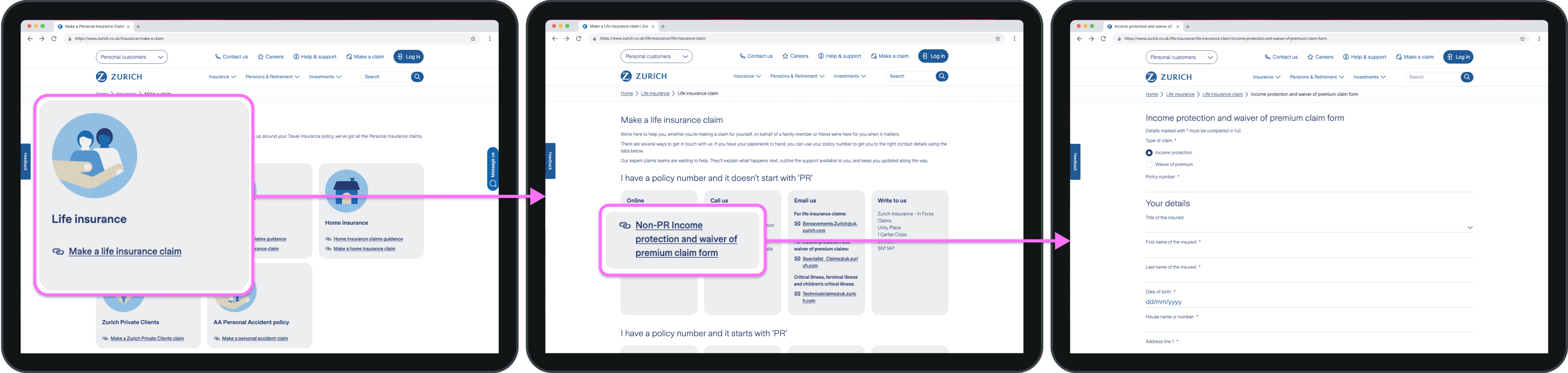
Working with the continuous improvement manager, a specialist in process optimisation, I analysed four major competitors, including Aviva and Legal & General, to understand industry standards and user expectations (Fig. 2). The analysis revealed consistent patterns our site did not follow. Competitors structured content by product type, with distinct pathways that made it easier for users to find relevant claim information.
They also provided clear guidance on claim requirements and processing times, which was absent from our site. These findings became key evidence that our categorisation approach did not align with established conventions.
Zurich Insurance
Aviva

Legal and General

Wesleyan

The Exeter
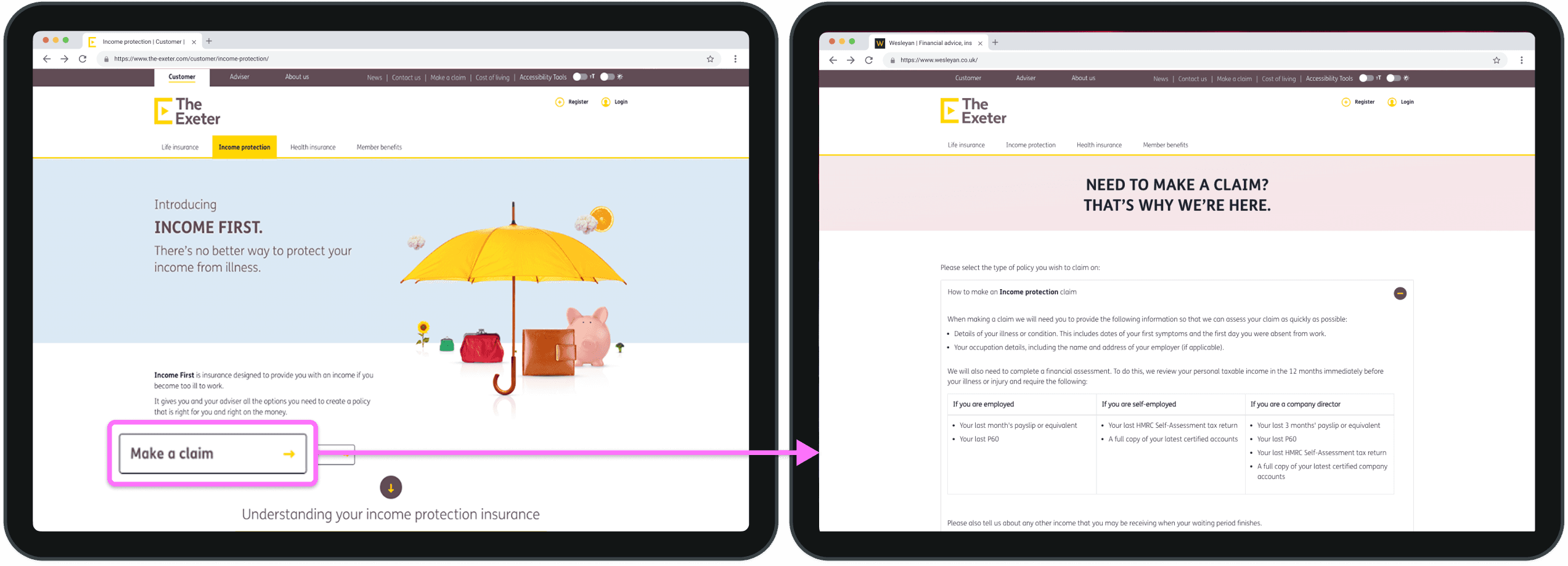
Fig. 2: Discovering industry standards our site ignored and how competitors created intuitive paths we failed to provide.
Digging into the data
Analytics confirmed my suspicions through a Sankey diagram (Fig. 3). It showed users repeatedly navigating between pages, cycling from claims to homepage to life insurance pages and back again. The data exposed a journey with numerous dead ends and scattered exit points.
This pattern showed customers trying different paths before abandoning their search. The data revealed that 82% of users who reached the claims section never completed their intended task. This demonstrated that the gaps identified in the competitor analysis reflected a significant business problem that had not been fully understood or prioritised.

Fig. 3: Digital breadcrumbs of frustration: analytics revealing how users desperately searched for income protection claims across multiple pages.
Talking to stakeholders
I conducted interviews with senior leadership, including the Head of Claims and the Communications team, to understand business priorities and operational challenges. These conversations revealed a critical disconnect: income protection policies were sold through brokers, but customers made claims independently without broker support.
The Head of Claims highlighted that income protection generated the highest volume of frustrated customer calls due to a lack of clear, accessible information online. At the same time, complex insurance terminology across communications was leading to incorrect claims and increased support costs.
This confirmed that improving online categorisation was critical, while also revealing broader communication issues that would need to be addressed in future phases.
User testing
I used the UserTesting platform, which I had previously advocated for, to run usability tests given constraints around internal recruitment and participant incentives.
The study used realistic scenarios where participants had experienced an injury and needed to submit an income protection claim online. To isolate the problem, users were placed directly on the life insurance claims page where the income protection forms were located.
“The results were shocking. 98% of participants couldn't find the forms despite being on the right page.”
Users did not expect income protection forms to sit under life insurance (Fig. 4), as it did not align with their mental models.
Video recordings of users struggling and becoming frustrated proved invaluable in stakeholder presentations, with even sceptical stakeholders unable to dismiss the evidence.
UserTesting finding: Income protection ≠ Life insurance
“You’ve actually taken me to the wrong page…. This doesn’t make any sense… this should be really easy to find”
UserTesting finding: Users want step-by-step claims guidance
“I want something that would talk me through it step by step… I would hope to find a section on here on income protection claims.. I’d probably go back to the homepage because this is for a life insurance claim”
UserTesting finding: Life Insurance categorisation triggers vulnerable users
“People that might have a life limiting injury or health concern don’t want to be clicking on life insurance….. and it could confuse someone or cause more anxiety or stress”
Fig. 4: UserTesting findings showing three key insights: users' confusion about life insurance categorisation, desire for step-by-step guidance, and emotional impact on vulnerable users
Pattern recognition
The research revealed a consistent pattern: income protection was incorrectly categorised. Analytics (Fig. 3) showed users couldn’t navigate the structure, stakeholders confirmed ongoing customer frustration, and user testing (Fig. 4) showed that 98% of participants couldn't find what they needed, even when starting directly on the page where the forms were located.
This demonstrated that the categorisation needed to change. The business case was evident: reduce digital abandonment, lower support costs, and better support customers when they need it most.
Action
With clear evidence that income protection required its own dedicated section, I defined a solution that worked within Zurich’s technical and organisational constraints while building stakeholder alignment.
I took an incremental approach, introducing changes that could be tested and validated at each stage. The focus was on reducing the 82% digital abandonment rate while ensuring customers had clear, accessible guidance when making a claim.
Solution development
I mapped the current customer journey (Fig. 5), which highlighted that the issue extended beyond categorisation. Customers needed clearer guidance, stronger signposting, and simplified language across the entire experience.

Fig. 5: Current state journey map, from initial hope to complete digital abandonment.
I led three iterations of the information architecture (Fig. 6), working closely with third-party developers, the CMS team, and the SEO specialist.
The first iteration separated protection products (life, income protection, critical illness) from general insurance (car, home), aligning the structure with user expectations. The second addressed technical constraints within the CMS. The third incorporated stakeholder feedback to ensure the solution was operationally viable.

Fig. 6: Information architecture evolution: from problem identification to user-centred restructuring within technical constraints.
Through the UserTesting platform, I partnered with researchers to conduct card sorting to understand how users naturally group insurance products. I then validated the structure through tree testing using realistic scenarios.
Results were shared in weekly sessions with the cross-functional team, building alignment that a dedicated income protection section was the right solution.
The MVP and stakeholder alignment
With the structure validated, I created an interactive prototype demonstrating how a dedicated income protection section would address the 98% failure rate (Fig. 7). I introduced a collaborative feedback process, enabling stakeholders to comment directly within Figma. Where access was a barrier, I ran remote group review sessions to gather feedback collectively and streamline iterations.
I facilitated workshops with product owners, customer service, underwriters, and claims teams to ensure operational feasibility. These sessions also surfaced broader issues with unclear terminology, such as ‘waiver of premium’, confirming that both categorisation and language were systemic issues across the experience.
Fig. 7: Interactive prototype. Try 'income protection' below 👇
Securing leadership buy-in
With departmental consensus secured, I collaborated with the continuous improvement manager to present the proposed solution to senior leadership, using competitor analysis (Fig. 2), analytics (Fig. 3), and user testing footage (Fig. 4) to build a clear, evidence-based case.

Fig. 8: From systemic breakdown to strategic solution - the evidence that convinced leadership to prioritise income protection
Leadership raised budget concerns. I highlighted that the cost of existing support calls already exceeded the proposed implementation, reframing the discussion around long-term efficiency.
The PR and Non-PR claims teams had historically struggled to collaborate on site changes, creating internal tension. I facilitated joint sessions to align both teams, while documenting decisions to build trust and reduce friction.
Insurance traditionally resists digital change and site restructuring. To address resistance to structural change, I used competitor analysis (Fig. 2) to show how industry standards had evolved, reframing it as whether we could afford not to catch up.
The user testing footage (Fig. 4) proved decisive. Leadership who had questioned the investment priority couldn't dispute customers' visible frustration, securing approval for the phased restructuring (Fig. 9).

Fig. 9: Complete redesigned experience across desktop, tablet, and mobile - solving the 98% failure rate with income protection now clearly visible and accessible
Constraints and trade-offs
With leadership approval secured, I needed to deliver the solution within technical and organisational constraints. The most complex challenge was the PR/Non-PR policy division. Our new CMS couldn't support dynamic forms based on policy type, and I couldn't merge the backend processes.
This meant users still had to identify whether they had a PR or Non-PR policy upfront. I redesigned the page using familiar contact methods and clearer policy number guidance, helping users identify the correct journey despite the technical limitation.
With limited developer releases each year, I built a prioritisation case using customer impact data, including call volumes and abandonment rates, alongside operational costs. I positioned the work as a high-impact, low-effort change, securing development time for implementation.
By focusing on the most critical issue, making income protection findable, and delivering immediate improvements while documenting future enhancements, I secured tangible results within real-world constraints.
Results
The redesigned experience transformed income protection claims from difficult to find into a clear, accessible journey. Tree testing showed a 100% task success rate, compared to the original 2% completion rate. Customers could now locate claim information and submit claims independently during an already difficult period in their lives.
Following launch, support calls reduced by 56%, translating to approximately £45,000 in annual operational savings. To measure long-term impact and demonstrate ROI, I introduced a tracking framework focused on:
Form-related support call volume - baseline comparison against historical data
Average claim submission time - from initial page visit to completed submission
Post-claim customer satisfaction - measuring experience quality and confidence in the process
Organisational impact
This project established a more evidence-based approach to decision-making, keeping stakeholders involved throughout the design process rather than presenting solutions only at the final stage.
The remote Figma review sessions I introduced were later adopted by other teams, while leadership who initially questioned the investment became stronger advocates for user-centred decision-making after seeing the testing evidence firsthand.
"I couldn't believe what I was seeing in those user tests. Honestly, we had no idea customers were so confused by our claims pages. Some of them were almost in tears trying to find information that should have been simple to locate. This redesign is going to completely change how we support people when they need us most."
Rachel Green
Continuous Improvement Manager
Learnings and reflections
The most powerful learning was how concrete user evidence cuts through organisational resistance more effectively than any design argument. When stakeholders watched users struggling, theoretical discussions became unnecessary. User testing isn't just research; it's a strategic tool for building consensus and driving change (Fig. 10).

Fig. 10: From tactical request to strategic transformation, how discovery revealed the real categorisation problem and established working methods.
I would have mapped the PR and Non-PR stakeholders earlier to better understand the political complexities before proposing solutions. Zurich's legacy policy structure meant different teams managed what customers saw as the same product. Understanding these dynamics upfront would have helped me navigate resistance more strategically.
This project refined my approach to stakeholder collaboration. I now prioritise building visual evidence early (Fig. 11), translating user needs into business language, and identifying opportunities to demonstrate value. Effective UX work requires equal parts design thinking and navigating company politics.
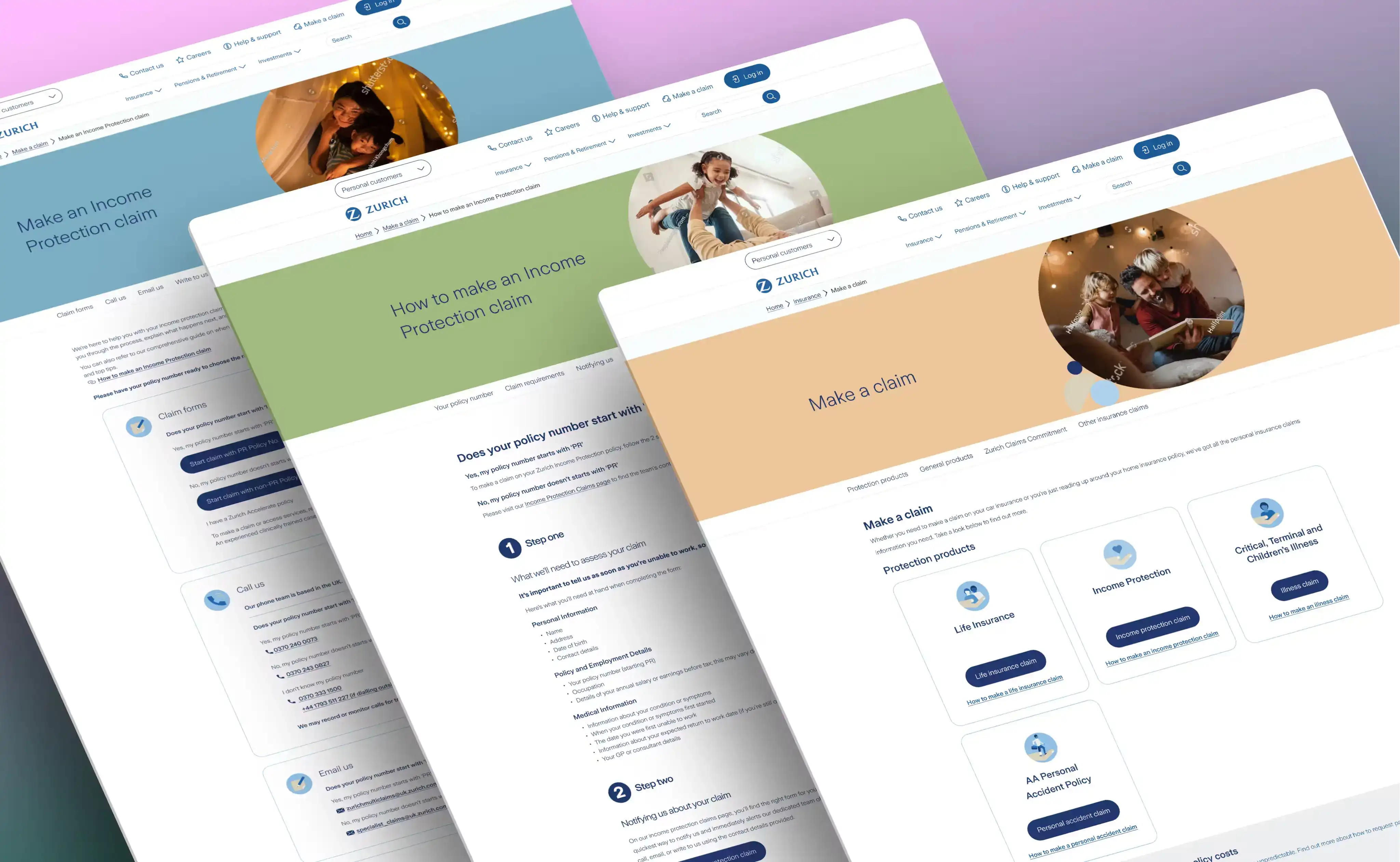
Fig. 11: Visualising the future state, wireframes that helped stakeholders envision the complete user journey redesign.
The £45,000 in annual savings and 100% success rate demonstrated that designing with empathy can also deliver measurable business value. Creating supportive experiences during critical moments builds customer trust and operational efficiency.
Next steps
The redesigned experience is now live. Customers can find income protection claim forms through a dedicated section with clearer PR/Non-PR navigation and improved guidance throughout the journey.
I am now leading broader language improvements across the experience. User testing revealed that insurance terminology such as “waiver of premium” caused significant confusion, with some customers perceiving it as deliberately misleading. Simplifying this language aims to reduce support calls, prevent incorrect claims, and better support customers during critical moments.
Capitalisation also became a point of contention across marketing, design, and communications teams due to the absence of shared standards, resulting in inconsistent experiences across the site. Through workshops and a shared Trello board, I am helping establish the organisation’s first cross-functional content standards.
This evidence-based approach demonstrated that user research could drive both measurable business impact and organisational change (Fig. 12). Other teams are now adopting similar methods to tackle complex customer problems across the business.

Fig. 12: The foundation for systematic transformation, demonstrating how user-centred design can reshape entire customer experiences.